

Why we start with questions
That’s why every Stoke identity project kicks off with a short discovery workshop. We ask questions. A lot of them. About purpose, audience, context, and what success actually looks like. It’s not just research—it’s about drawing the lines that give us creative freedom.
When the guardrails are clear, we waste less time guessing and more time designing with intent. It means fewer detours, tighter concepts, and a better chance of landing something that feels right.
What the Noun Process is (and isn’t)
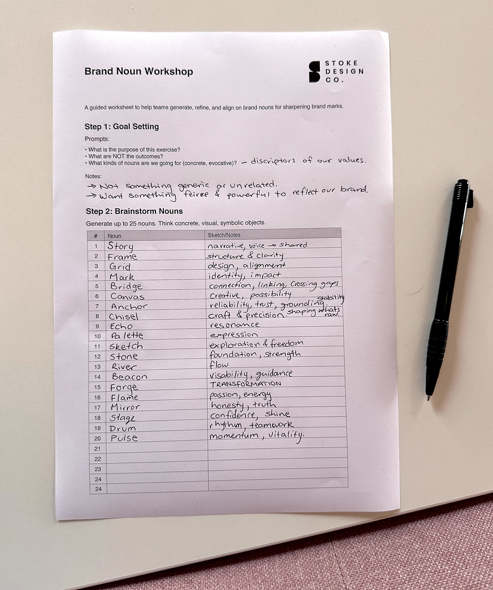
One of our favourite tools from that workshop is what we call the Noun Process. It’s a focused naming exercise, originally popularised by designer Allan Peters, and it’s become a staple in our logo design workflow.
Here’s how it works:
-
Stakeholders throw out 15–20 nouns that feel true to the brand. Think anchor, path, shield, flame—concrete words you could sketch.
-
These nouns become creative filters, shaping where we take the symbol (the brand mark) and where we don’t.
-
They’re not mood descriptors. Not adjectives. And definitely not for the whole brand system. This is about the mark only—not type, colour, tone of voice or naming.
We sometimes convert abstract values into metaphorical nouns. If a brand wants to express “trust,” we might use shield, key, or lock. Pictureable ideas always win here.
Put simply: it’s a low-friction way to align early and make smarter design decisions later.
How we run it
We keep the session light, collaborative, and fast. No slides, no fluff.
1. Set the goal
We explain what we’re doing and why. It’s about exploring symbols, not solving the whole brand.
2. Collect nouns
Everyone throws in ideas. We push for objects, symbols or scenes you could literally sketch. If it starts to sound like a values deck, we pivot.
3. Refine the list
We merge overlaps, clarify meanings, and make sure there’s a healthy spread. A strong list has breadth but still feels focused.
4. Sign-off and share
We document the final 15–20 nouns and treat them as the creative brief for the mark. This becomes the filter we use when sketching.
Why it works
We’ve tested this method on hundreds of branding projects—and it consistently speeds things up without sacrificing creativity. Here’s why:
-
Focus without tunnel vision
Designers explore boldly within a shared sandbox. It cuts the guesswork and reduces revision cycles. -
Shared ownership, not micromanagement
Clients steer the subjects. We handle the execution. No one’s in the dark, and the process feels collaborative, not chaotic. -
Faster alignment, fewer surprises
When everyone agrees on the nouns, we’re all aligned before we jump into Illustrator or bring out the sketchbook.
When we use it
We bring the Noun Process into play when:
-
A new brand needs a distinct, meaningful symbol.
-
A rebrand needs to replace a weak or generic mark.
-
A mark refresh needs to retain some equity but find a clearer idea.
-
There are multiple stakeholders (hello, higher ed, gov and not-for-profits) and we want alignment upfront.
What to expect from us
We take the noun list and go wide in sketching. We’ll often test 1–2 nouns at a time—or combine them. (Path + flame = guidance/energy.) That’s where originality comes from.
You’ll get clear rationales that map every concept back to the nouns you approved—not subjective guesses or “vibes.”
We’ve used this process to build logos for brands across Ballarat, Victoria, and beyond. The pattern is clear: fewer revision rounds, stronger marks, and faster approvals. No fluff. Just a practical tool that works.
FAQs
Isn’t this limiting?
Not at all. It narrows the field to ideas you’d actually say yes to. That gives us more confidence to go deep and explore boldly.
Does this decide colours or type?
Nope. This only guides the brand mark. Colours, type and tone each get their own exploration.
Where did this come from?
The method is widely taught now, but we first encountered it through Allan Peters’ talks and his excellent book Logos That Last. Highly recommended for designers or anyone curious about the thinking behind strong marks.