

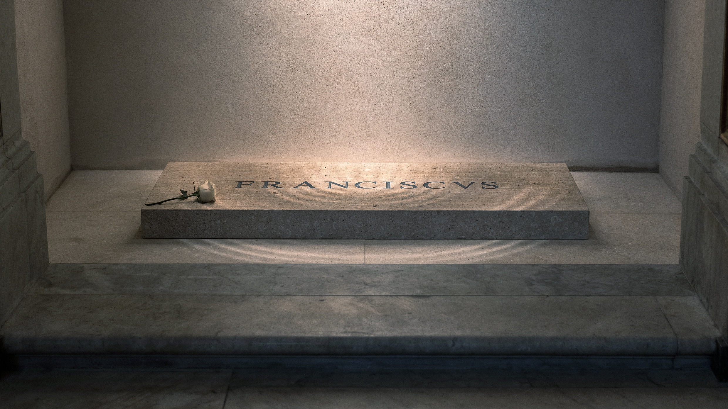
When Pope Francis passed away, the world came together to honour a man known not for extravagance, but for empathy, humility, and quiet reform. He led with compassion and grounded the papacy in a more relatable, down-to-earth tone. So it’s no surprise that his final resting place reflects that same modest spirit: a simple Ligurian slate tomb in Rome’s Basilica of St. Mary Major, engraved with just one word, FRANCISCVS.
But as someone with a deep appreciation for design, I couldn’t help but notice something unexpected. Not in the materials or the message, but in the typography. Specifically, the kerning.
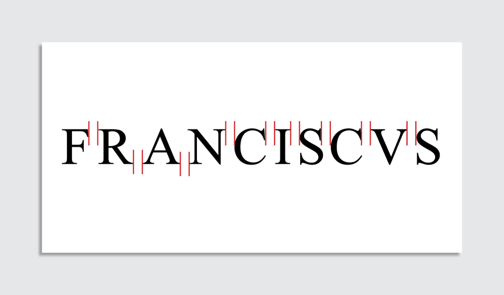
“FR A NCISC VS”
Mumbles about kerning.
Photo via https://t.co/MZAjIwKG5C pic.twitter.com/s3IKzn46lB
— Jeroen Wiert Pluimers @[email protected] (@jpluimers) April 27, 2025
Kerning, for the uninitiated, refers to the spacing between letters. When done well, you don’t notice it at all. But when it’s off, it can stop you in your tracks. In this case, the inscription — meant to flow as one dignified name — instead appears oddly spaced: F R A NCIS VS. Letters seem to float apart at random, as if they’ve had a quiet disagreement.
This isn’t just a design quirk picked up by eagle-eyed typographers. It’s been called out by experts around the world. Cheryl Jacobsen, a calligrapher and professor at the University of Iowa’s Center for the Book, described the spacing as “horrifically bad,” and pointed out that there’s no historical or artistic reason it would look this way. Christopher Calderhead, editor of Letter Arts Review, noted that the font used, Times New Roman, is designed for printed documents, not carved inscriptions. Its letterforms simply don’t translate well to stone without careful adjustment, particularly when engraved by machine.
From what has been reported, this wasn’t a deliberate design decision or a hidden theological statement. It’s likely the result of mechanical engraving without manual kerning corrections, a process where the letters are evenly spaced in a mathematical sense, but not a visual one.
That said, there’s something beautifully ironic about it. Pope Francis was never about polish. He focused on substance over style, connection over performance. Maybe this slight imperfection, this tomb that doesn’t look perfect but says exactly what it needs to, is unintentionally the most Francis thing of all.
So while the spacing may be off, the sentiment is exactly right. A plain slab, a single word, and a quiet place for reflection. No gold leaf, no marble opulence, just a humble tribute to a profoundly human leader.