What exactly is the difference between branding, identity, and logos? This question pops up a lot.
Business owners feel they don’t want to overcomplicate things by developing their branding, however, in most cases, they already have a brand and don’t even know it!
When you combine these three things together you have the power to position yourself within a market. It sets the tone for your customer regarding your business offering, unknowingly leaving a lasting imprint of who exactly you (or more specifically your business) are. What’s the old saying… First impressions last.

How do these things all fit together to form a brand?
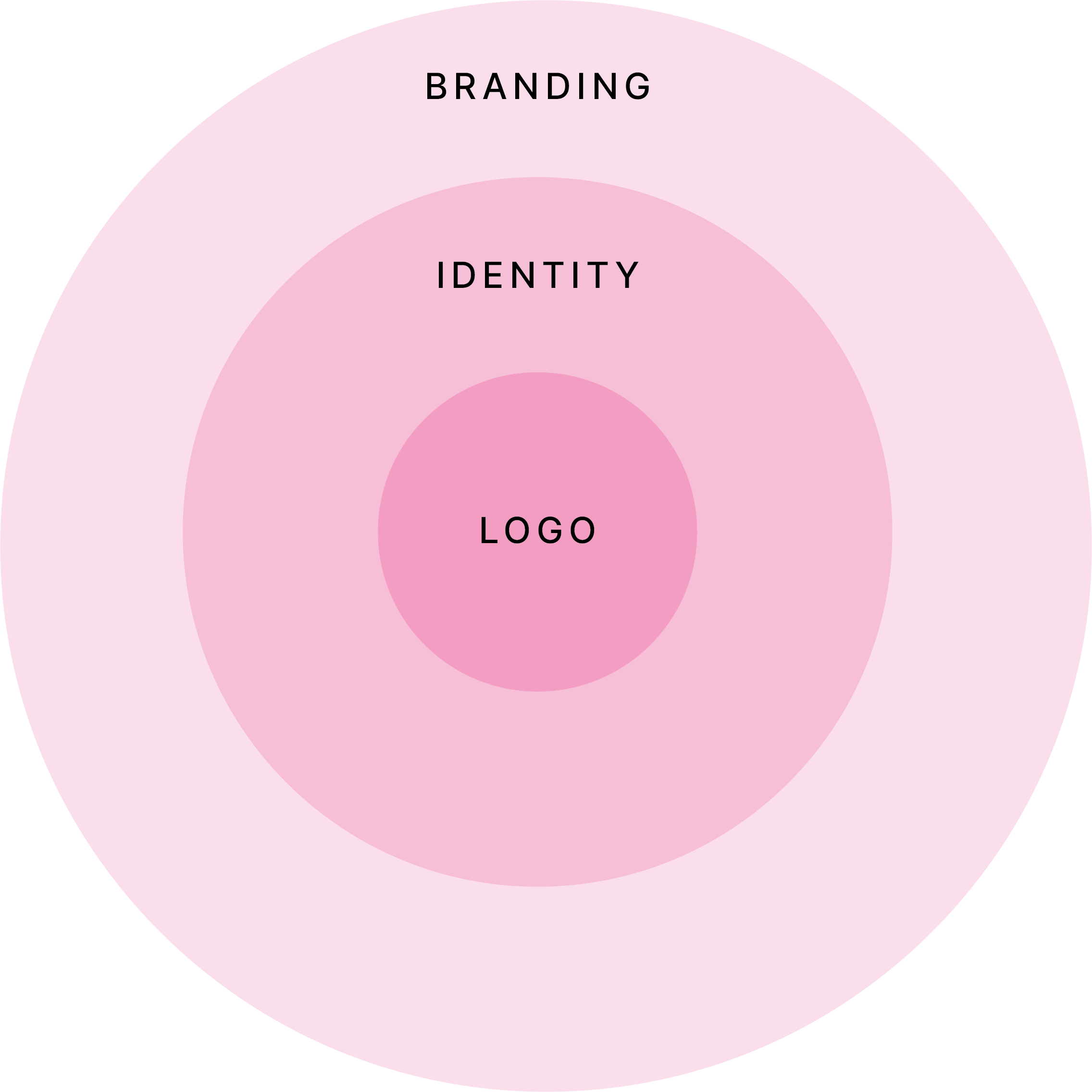
There is so much more to branding than meets the eye. There are three core components to your brand – and they all fit within one another.
What is Branding?
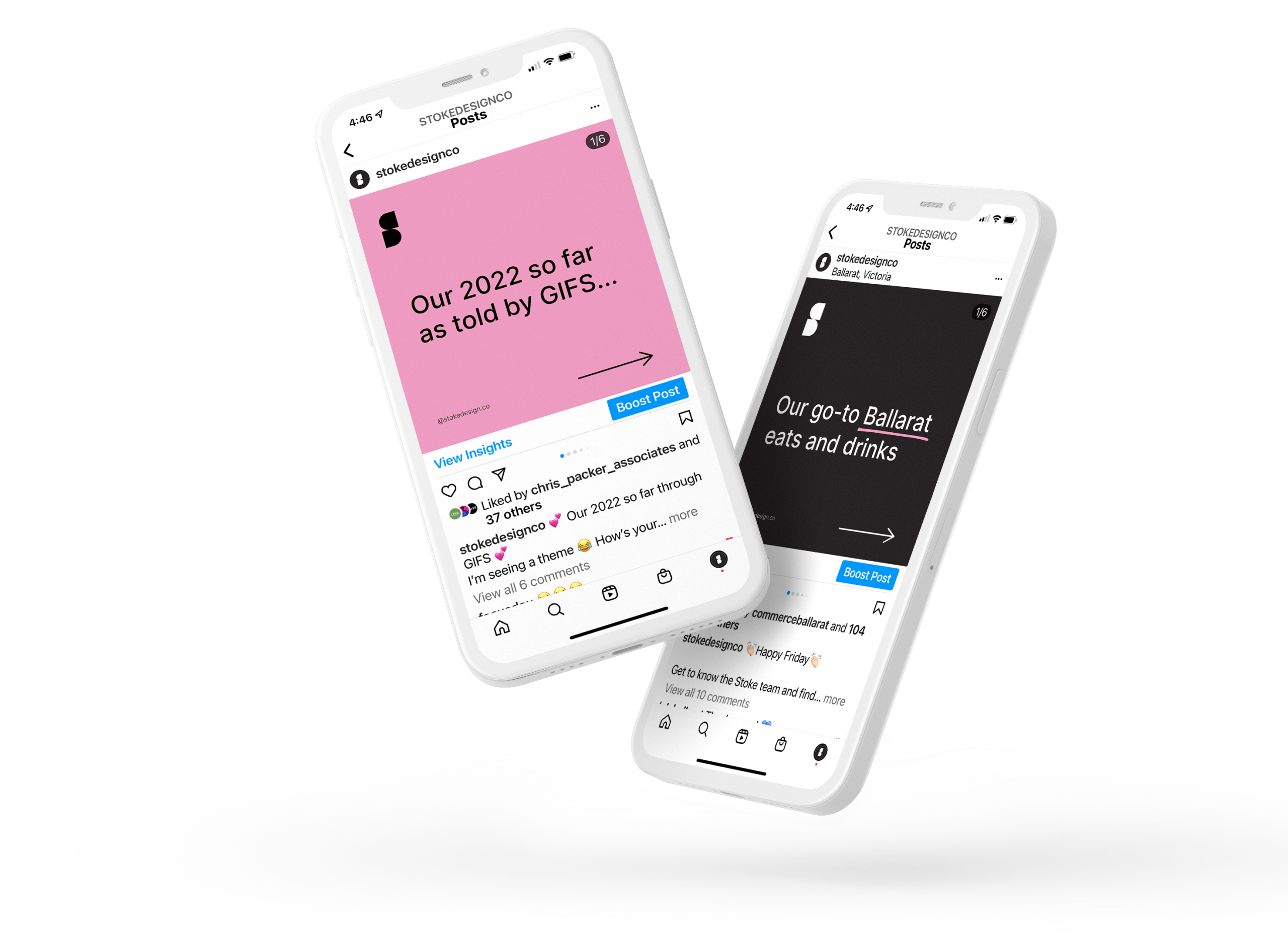
Your branding is defined by the emotional reaction a customer or client feels. This could be done via your tone of voice used via your copy (text/writing style), your social channels, the style of photography you use or even how your office/shop feels when someone enters. Is it fun or professional? Homely or sterile?
What is identity?
Identity is a word we here at Stoke throw around a bit that tends to leave some confused looks on people’s faces. Your business’s identity is all the visual aspects that form part of the overall brand. This may be all the design assets such as logos, patterns, illustrations and more. It’s anything that’s needed visually to tell your brand’s story.
What is a logo?
A logo helps identify a business in the simplest manner possible. It can be a mark, icon or text. When people look at it they know who it belongs to. Take the Macca’s ‘M’ as an example. You see those golden arches and you know straight away it’s McDonald’s without being fed any additional information, such as the business name etc.
Give me an example!
Sure! Let’s look at Stoke’s branding.
We define our brand as playfully professional. This means we know our stuff, but we have fun while doing it.

The Branding
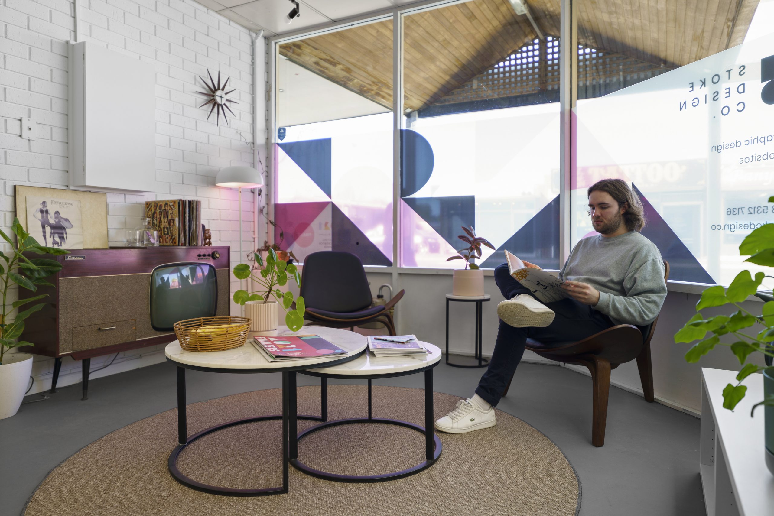
We are playful in our language yet professional, which is sometimes a delicate balancing act, but this ensures that whilst we are a professional service, we remain approachable and human. When you walk into our studio, it’s painted in our colours, we have cool walnut furniture and a small jungle of indoor plants. Pretty chill and cool right? The above has nothing to do with any graphic design but has an impact as a whole.

The Identity
Stokes identity is made up of a number of elements. We have our logo, of course, our patterns of geometric shapes, our textured “noise” background, and our hand-drawn shapes we use to introduce that human element into our very minimalist design.

The Logo
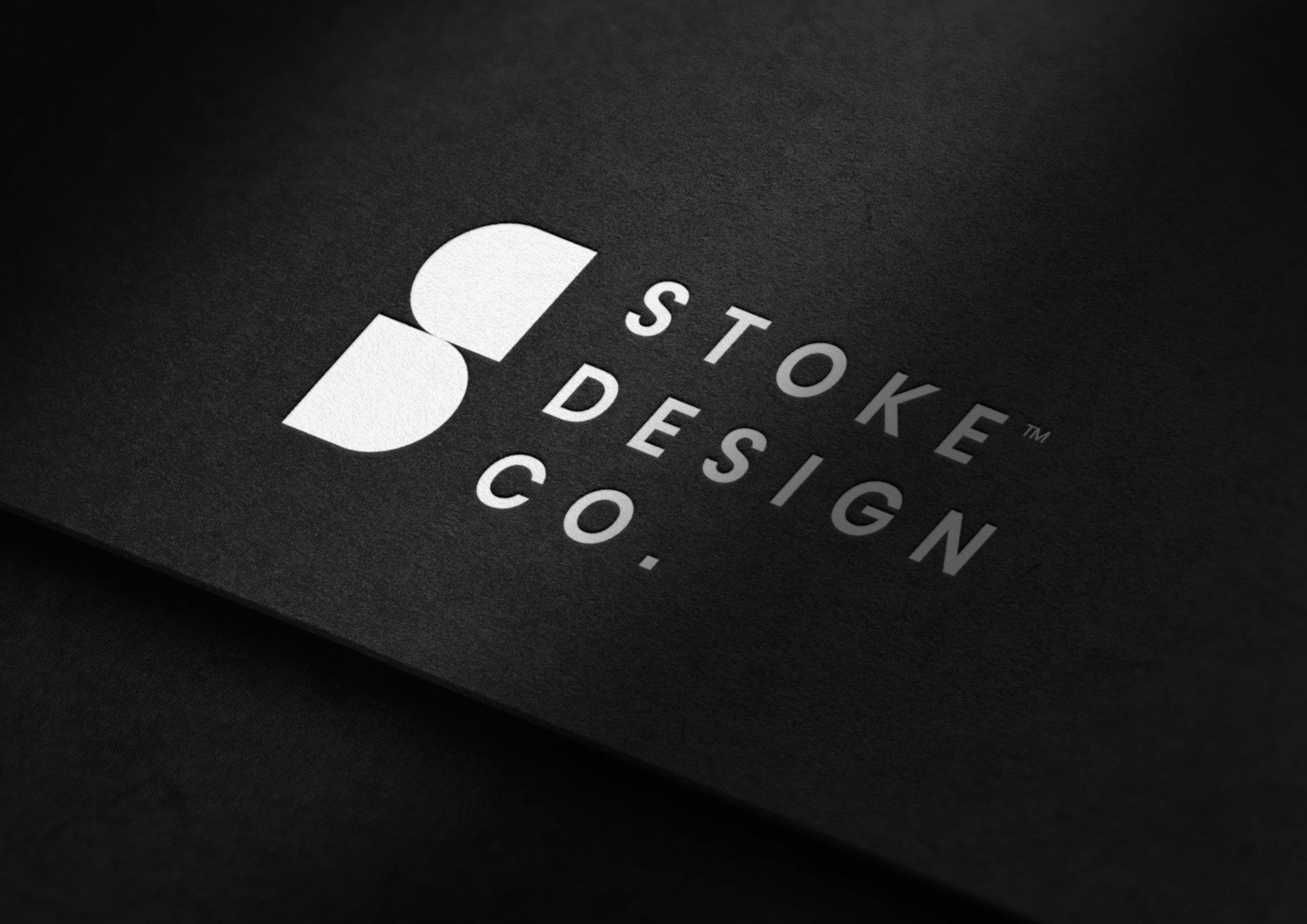
It’s that simple. There are a million different styles of logos, ours is minimal, simple and with a hint of Mid-century influence.
Logos can be responsive, sometimes it’s in its full entirety, other times it’s just the brand mark.
Where do you start developing a brand? Seems complicated.
As we touched on earlier, those that think they don’t have a brand need to think again. I struggle to picture any type of business that doesn’t have a brand or a public perception of its image. Whether you are looking at developing a brand for a new business or rebranding for an existing business, there are a few questions you need to ask yourself:
- What is the why?
- What are your strengths?
- What are your weaknesses?
- What are your values?
- Who is your ideal customer?
How many of the questions above do you have an answer for? Some are definitely easier than others.
It can be overwhelming, but this is an excellent starting to point to start kicking ideas around your head. At Stoke, we have developed a process of asking the right questions to ensure we can learn everything we need to know to deliver a great brand.
